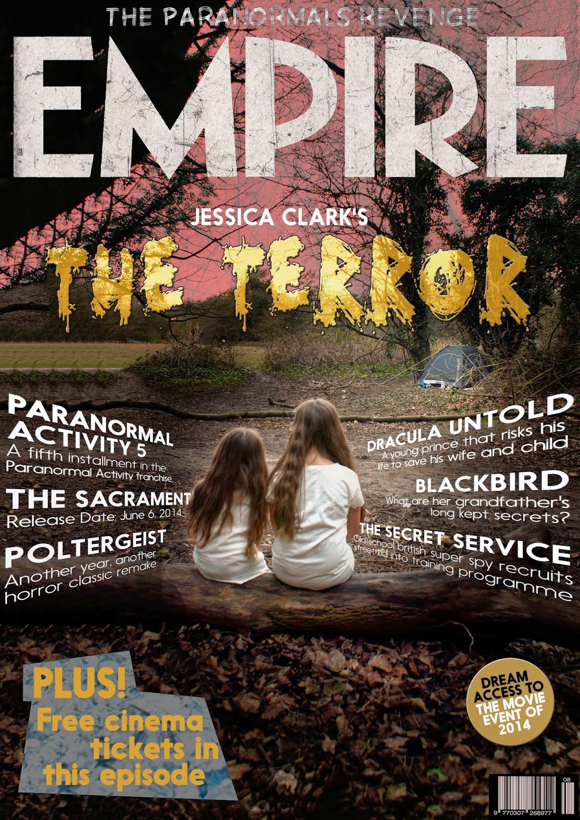
Monday 17 February 2014

Setting - Location - Mise-en-ecene


These images show the location where I chose to film my trailer. I chose this location as conventionally horror films are set in a very dark and derelict place and I feel this was perfect. The trees and grass land allow it to look like no one is around for miles helping to show that the characters are alone with no chance of help. The branches and trees could also show that there is no clear way out from where they are, again reinforcing that they can’t get out easily. A forest was one of the top locations for a horror film to be set in my research; however the most conventional was an old house. I chose challenge this convention and use a forest setting as I felt there was more freedom in terms of different types of shots that I could use here and I wanted my overall trailer to be unique and stand out from any other competing horror film trailers they may be.

Sunday 16 February 2014

Scary Characters


I chose to use two young girls as my scary characters because of the reaction I would get from it. The audience, I assume, would see the young girls as vulnerable and not capable to cause any harm however the audience will be shocked when they realise that these are the antagonists in the trailer. I chose matching pale coloured clothing for the both of them to show that they are sisters and so that they appear ‘ghost like’.

My Main Character


Francesca is going to be the main character in my film trailer. She is playing the part of one of the girls who go camping however she is the one who becomes possessed. In terms of clothing (mise-en-scene) I asked Fran to wear a red hooded top because of the connotations surrounding the colour red like danger and anger. Wearing a hooded top also works well with the setting of my trailer as it is in a woods where it was fairly cold so I feel her clothing works well alongside this. Francesca is wearing black jeans as I wanted this to suggest that she is going to turn evil/become possessed, and i felt that this dark colour would support that. I have cleverly matched Francesca's clothing with the title of my trailer. If you look carefully as my title designs you can see that one them is black and red gradient, i think this will help create a type of continuity and link between the text (and the meaning behind it) and the main character. Overall I feel her costume/outfit suits well for the genre of my trailer and will help to show and reinforce the genre throughout.

Saturday 15 February 2014

My maazine front cover


My Magazine Front Cover


Here I have show the different stages I have take in making my front cover for a film magazine, featuring my film. The final image shown I feel is he most effectivead inludes many conventional features of a front cover film magazine, however some are challenged, in this case the uusual framing of the photoragy used.

The Terror title on my magazine


These edits show my experimenting with fonts, layer blends and also positioning for the title of my trailer to be featured on the front cover. I have chosen spooky fonts so that it fits with the genre of the magazine; I haven’t however used the same font that has appeared in my trailer because this was too thin and difficult to see. I like the white colour text as I feel this links well with the main title of the magazine.


Friday 14 February 2014

Photograph for my film magazine


This is the photograph which I have chosen to use for the front cover of my film magazine. It challenges the conventions of a film magazine front cover in many ways, for example the unconventional framing. I have however done this for a reason, as I want my film to look different to any of the other ones ever featured in the magazine, and I feel my changing the ‘norm’ of what the audience are used to seeing this will catch their eye and make them interested in my product. I have chosen to edit the photograph to make it look scarier by making the shadows darker on Photoshop. I have also added a red gradient map onto the image and used the ‘darken’ layer blend to make a slight but effective change. The final edit I made to the image was to add a ‘dust and scratches’ layer over the top which allowed for a spooky looking image (linking well to my other products). I realised that the title may become more difficult to see because of the darkening of the photograph so I have chosen to include a variety of title colours and styles to see which will work best for my final product.


Film Magazines Title Edits


Here I have chosen to experiment with editing different titles to see which I think will give the best effect for my film magazine. The first title displayed is the original empire title, and I think this plain red text is effective for a mast head as it is conventional of a magazine and it stands out clearly. The one underneath this is one in which I have created. I chose to use black text with a red out line as I thought these colours would fit well with my genre. I like this edit however it depends on the colour of the background to weather I am going to use it for my final front cover. The next two edits are similar as I have used a black and red gradient on both. I feel the gradient helps to add depth to the mast head making it look appealing and stand out. Again, with these titles it would depend on the colour of the background behind it to weather I would use them or be able to use them on my final magazine. The final mast head I have created has been blended on Photoshop with a dust and scratches effect. I like how this title looks similar to the original Empire title but however I like how the effect has helped it link to my horror genre more closely. There is a high possibility I will use this title for my final magazine as I think it will work well on most coloured backgrounds.

Thursday 13 February 2014

Film Magazines


These are some front covers which I came across on the internet when I typed in ‘film magazines. My AS coursework of making the front cover of a music magazine really helped me when analysing these magazines as I know what the main features are to look for and I not know what works well. I believe ‘Empire’ is the film magazine which will most closely relate to my genre of film. I think this because on the Empire front covers displayed above, they advertise films that are of a similar genre to mine. They also have a spooky and surreal look about the design and I feel this will also suit my genre well. The Empire mast head is more commonly red and of a bold type. A red masthead is conventional of many magazines and I feel the fierce and prominent colour makes it instantly stand out to any type of audience. The main image displayed on the front of Empire magazines is usually a medium closeup. This allows the audience to see the clothes of the actor/actress displayed on the front whilst also being able to see there facial expressions clearly. I feel this would be a good framing to use for the front of my magazine as I need the photograph of the antagonist to look scary and to intrigue the audience into watching the film. The cover stories or cover films in this case are usually coloured white or sometimes black. I think this is so there is a constant house style throughout all of the Empire magazine and also because black and white are clear colours which will stand out on mostly any coloured background chosen. In my selection of example film magazines there are only 2 magazines which include a secondary image. I don’t think I am going to include a second image on my front cover as I think it draws the attention away from the main image and this is not the effect I want my front cover to have on the audience. Overall when creating my front cover I am going to refer back to Empire magazines and use similar features and conventions to it, as I feel this will work best with my film genre chosen.

Saturday 8 February 2014


These are my poster edits with photographs included in them. I believe the second and the last are the most effective because of the scary red texture across the front of Francesca’s face. I am going to continue editing these posters until I active the best outcome I can.